Auto Marketplace
Project Digital Motors
Role Director, User Experience
Year 2022
As the sole product designer, I addressed the challenges of creating a comprehensive automotive online store. The flagship product, tailored for both dealers and customers, prioritized a seamless and efficient online car buying experience. Despite being my first venture into the automotive industry, I found the experience engaging, creative and highly rewarding.


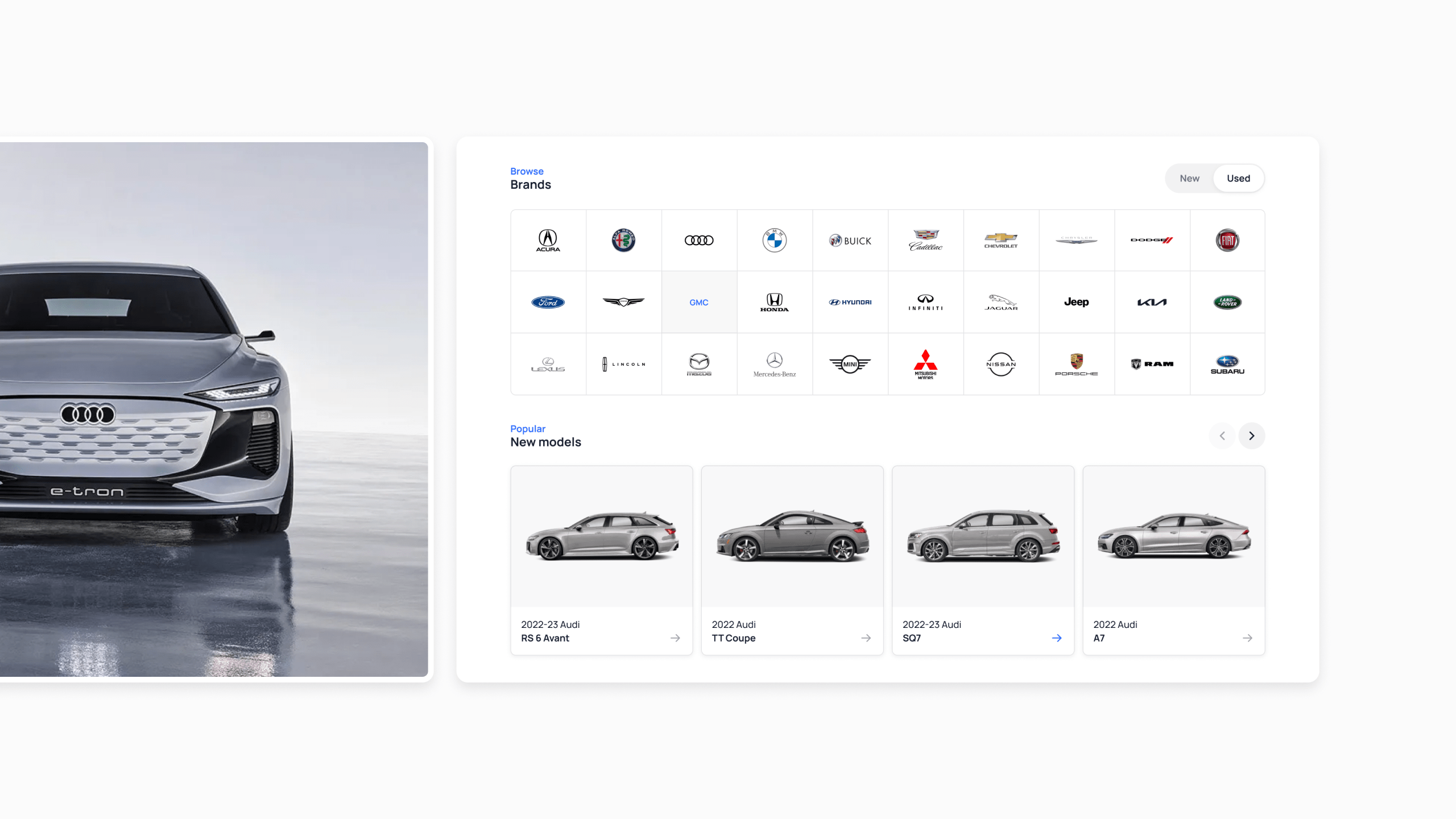
I identified key shopping preferences, leading me to focus on a clean, modular interface for the homepage. With the ability to be themed, I designed flexible components for easy configuration, ensuring adaptability to any brand’s unique colors, fonts and desired layouts.

My focus on the search results page centered on streamlining vehicle-related information. I took out non-essential elements, consolidated filter options, and seamlessly integrated the payment type filter into the page title. The goal was to enhance scan-ability and provide users with a straightforward and efficient search experience.

When creating the vehicle details page, I adopted a minimalistic approach to avoid overwhelming users with information. Prioritizing a seamless experience, I took care to maintain consistency between the desktop and mobile versions. My attention also extended to optimizing for SEO to boost traffic from search engines. Given that many visitors enter through this page, I incorporated recommendations for other vehicles to encourage engagement.


Managing the substantial amount of user data during the credit application posed a challenge. While my initial inclination leaned towards a multi-step process, user testing indicated a preference for a more streamlined single-page design. Notably, completion data revealed that users were able to finish the single-page application in nearly half the time, emphasizing the effectiveness of this approach.

Following the Credit Application, the user proceeds to select a lender offer, with the experience shifted into the user’s account section accessible from the top account dropdown in the header. With this approach I considered re-entry, ensuring users can easily access their current or previous orders without feeling disoriented.

To streamline the purchase completion process, I implemented a task-based notification system within a simple interface. This system notifies users of the next required tasks, and the call-to-action in the alert directs them to the appropriate page.


